How I Mixed Bold Floral Wallpaper With a Neutral Paint Color (Without Overwhelming the Room)
If you’ve been around here for a while, you know I love a calm room.
But I also love personality.
This space has both and it all comes down to how I mixed bold floral wallpaper with a grounding paint color.
Before you assume bold wallpaper makes a room feel busy, let me show you why it doesn’t have to.
Affiliate Disclosure
This post may contain affiliate links. As an Amazon Associate, I earn from qualifying purchases at no additional cost to you. I only share products I genuinely love and use in my home.
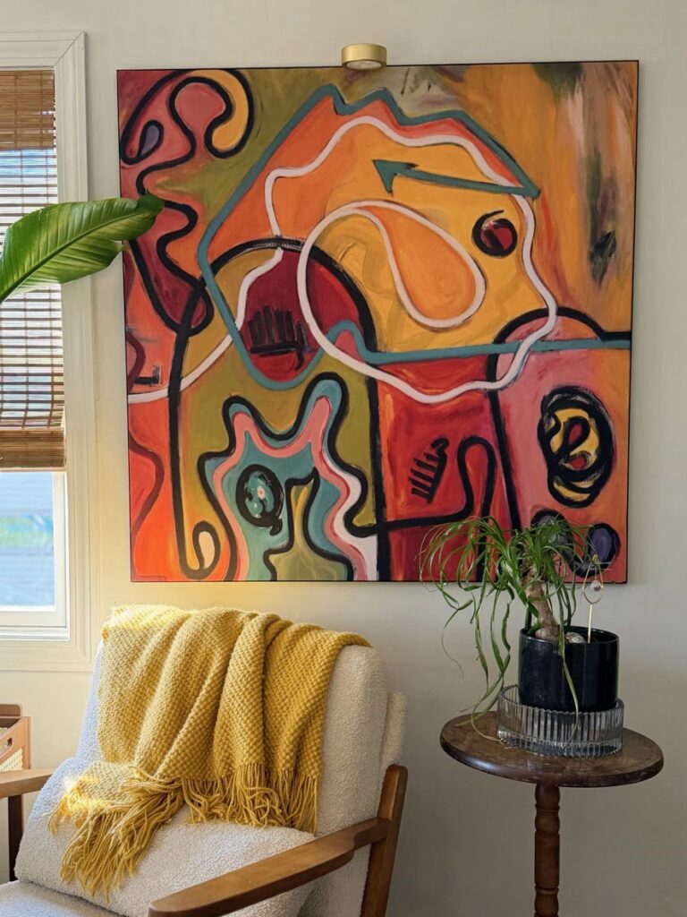
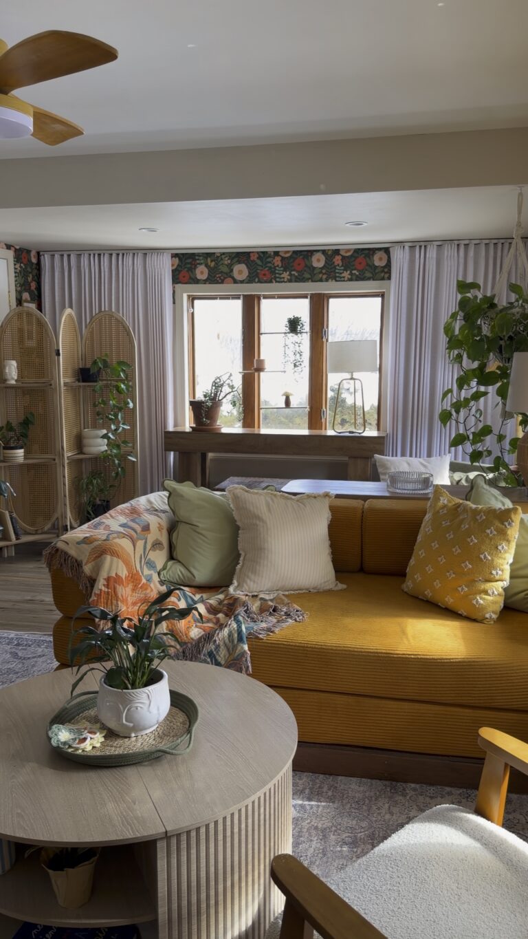
Start With a Grounding Paint Color
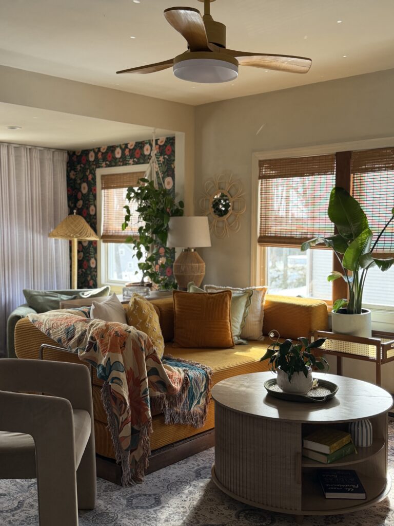
The walls in this room are painted Rivers Edge by Sherwin Williams.
It reads neutral, but it has depth. It’s not stark. It’s not cold. It has just enough warmth to support everything else happening in the space.
That’s important.
If your wall color is competing with bold wallpaper, the room will feel chaotic.
If your wall color acts as a backdrop, the wallpaper gets to shine without overwhelming the space.
When choosing paint to pair with wallpaper, I always look at undertones first. Rivers Edge pulls softly warm, which works beautifully with the coral, blush, and deep green in the floral print.
Keep the Wallpaper Contained
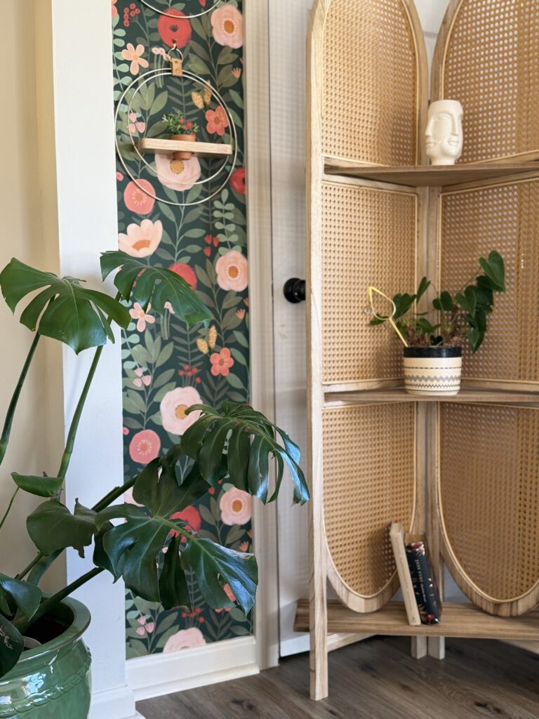
I did not wallpaper every wall in this room.
And that’s the key.
Using wallpaper as an accent keeps it intentional instead of overpowering.
This particular floral wallpaper is from Amazon linked here.
It’s bold. The scale is large. The colors are saturated.
If I had wrapped the entire room in it, it would feel heavy.
By containing it to specific sections, the eye has somewhere to rest.
Repeat the Colors, Don’t Match Them
Look closely at the room and you’ll notice something.
The mustard sofa echoes the warmth in the florals.
The green pillow connects to the leaves.
The plants repeat the deep greens again.
The wood tones add warmth without introducing a new color story.
Nothing matches exactly.
It repeats.
That’s the difference between themed and cohesive.
If you’re mixing wallpaper and paint, repeat one or two tones softly throughout the space. Don’t introduce five new colors just because they’re in the print.
Use Texture to Calm Pattern
Texture softens bold pattern.
The cane privacy screen.
The fluted coffee table.
The linen curtains.
The boucle chair.
All of that organic texture balances the graphic floral.
If everything in this room were smooth and shiny, the wallpaper would feel louder.
Texture makes it layered instead of busy.
If you’re recreating this look, here are a few similar texture pieces:
Cane Privacy Screen
Neutral Linen Curtains
Floral Throw Blanket
I also always use warm bulbs (2700K) in this room. Cooler lighting would completely change the mood.
Leave Breathing Room
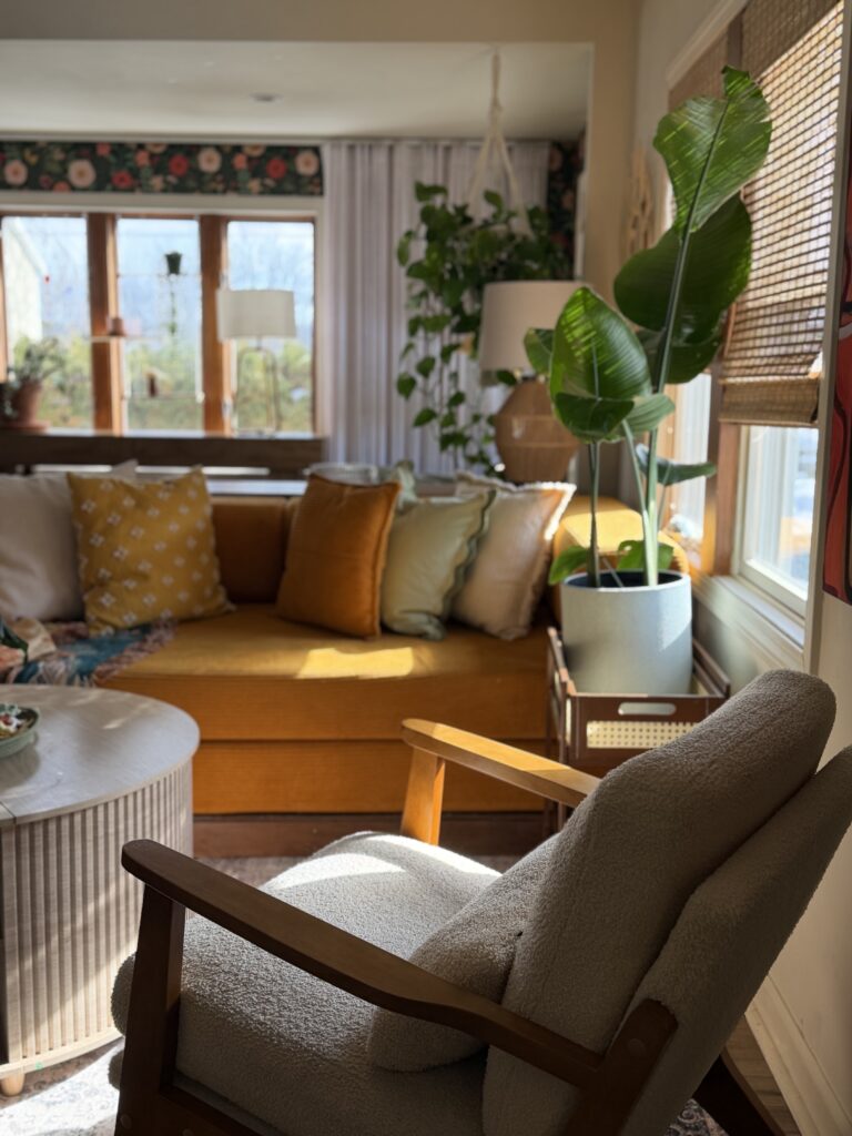
Notice the large wall of curtains and neutral space.
That breathing room matters.
When mixing bold wallpaper with neutral paint, you need visual pauses.
Pattern → calm → pattern → calm.
That rhythm keeps the room from feeling overwhelming.
Final Thoughts
Bold wallpaper doesn’t have to mean a loud room.
If you:
• Start with a grounding paint color
• Contain the wallpaper
• Repeat tones softly
• Add texture
• Leave breathing room
You can absolutely mix pattern and neutral walls without losing that calm, cozy feeling.
This room feels layered and intentional, but still relaxed.
And that’s always the goal.
If You’re Decorating This Way, You’ll Love These Too
If you’re drawn to this mix of bold wallpaper and calm paint, you might like a few other spaces I’ve shared.
In my post on how to make your living room feel layered instead of flat, I talk more about lighting, texture, and why overhead lights alone don’t work.
If you’re curious how I styled this mustard sofa and layered the pillows, I shared more details in what’s in my living room right now.
And if you love cozy corners, my breakfast nook makeover shows how I use the same layering principles in a smaller space.
I decorate every room with the same mindset. Start neutral. Add warmth. Repeat tones. Layer texture. Leave breathing room.
Once you understand that formula, you can use it anywhere.
Full Affiliate Disclosure
Some of the links in this post are affiliate links, which means I may earn a small commission if you purchase through them, at no additional cost to you. I only share products I genuinely use and love in my own home. Thank you for supporting Two Story Bungalow.